Logo Design
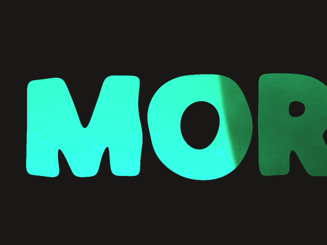
Working with the passionate team at eVita Naturkost was a rewarding experience! Together, we crafted a fresh and dynamic brand identity that reflects their love for organic, natural foods and a healthy lifestyle. eVita Naturkost's mission is simple: to make wholesome living easy and accessible, and we wanted their logo to tell that story.
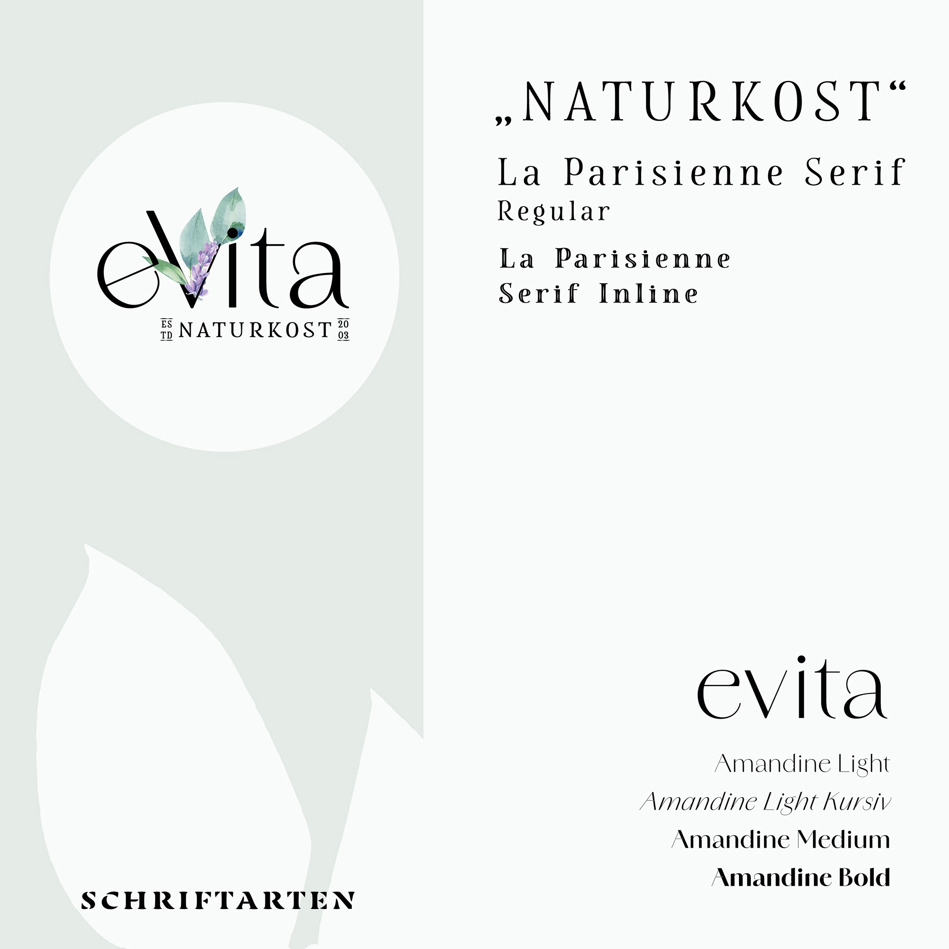
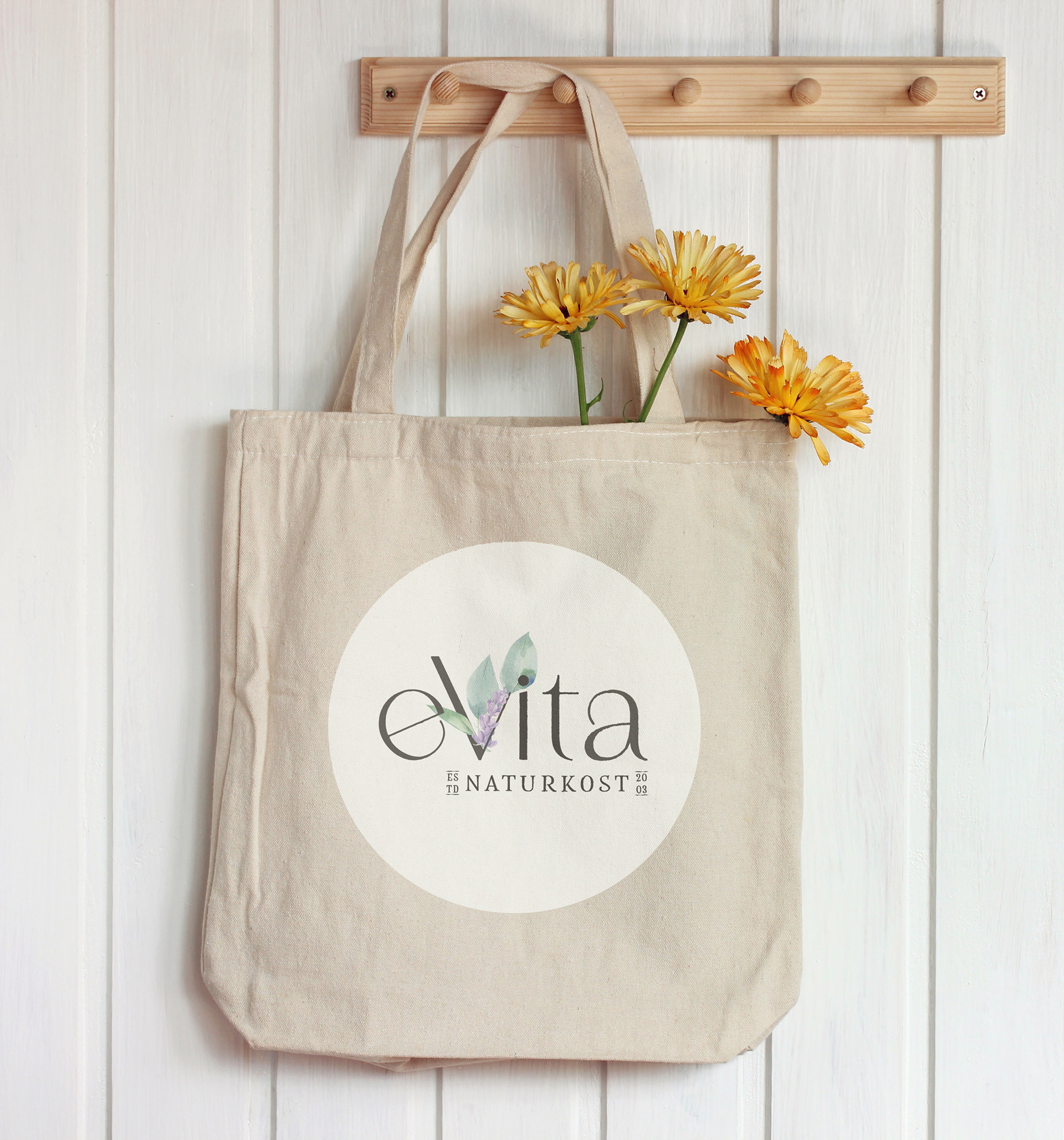
The new logo is all about nature, vitality, and simplicity. We kept the design clean and modern, using a vibrant, nature-inspired color palette to give off those fresh, feel-good vibes. The logo blends organic shapes with earthy tones to reflect eVita's commitment to sustainability, while staying fun and approachable for health-conscious customers.
www.evita-naturkost.de
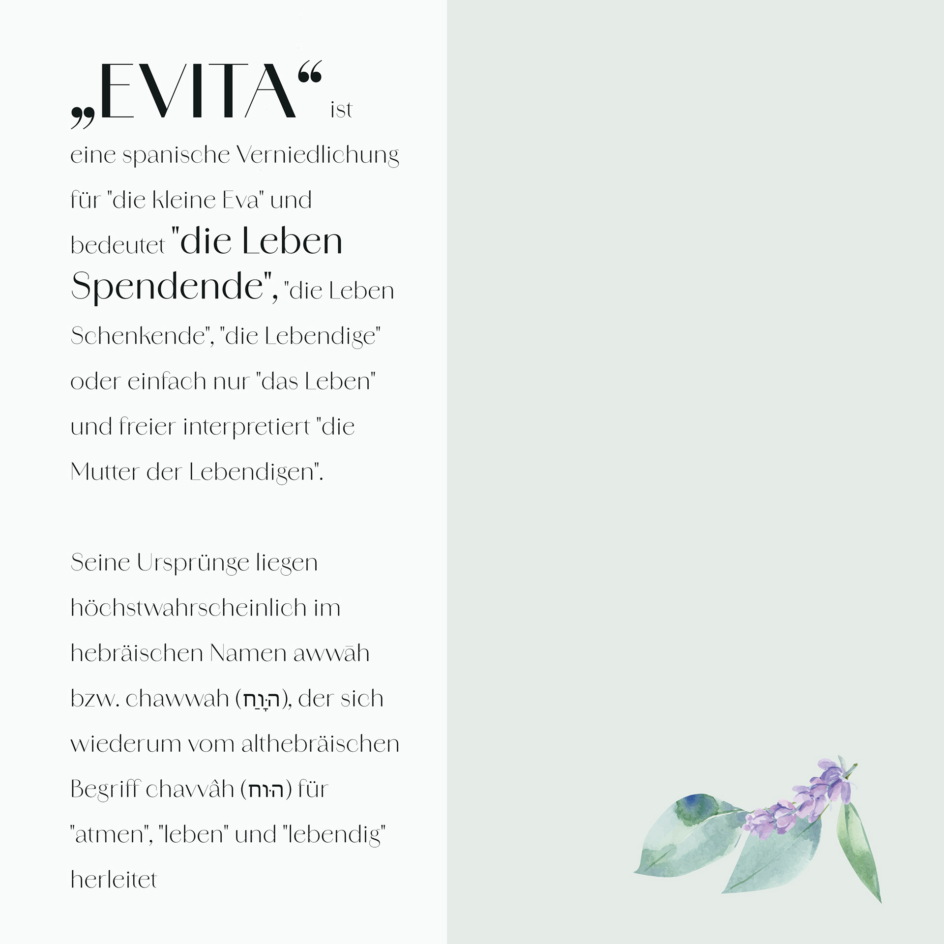
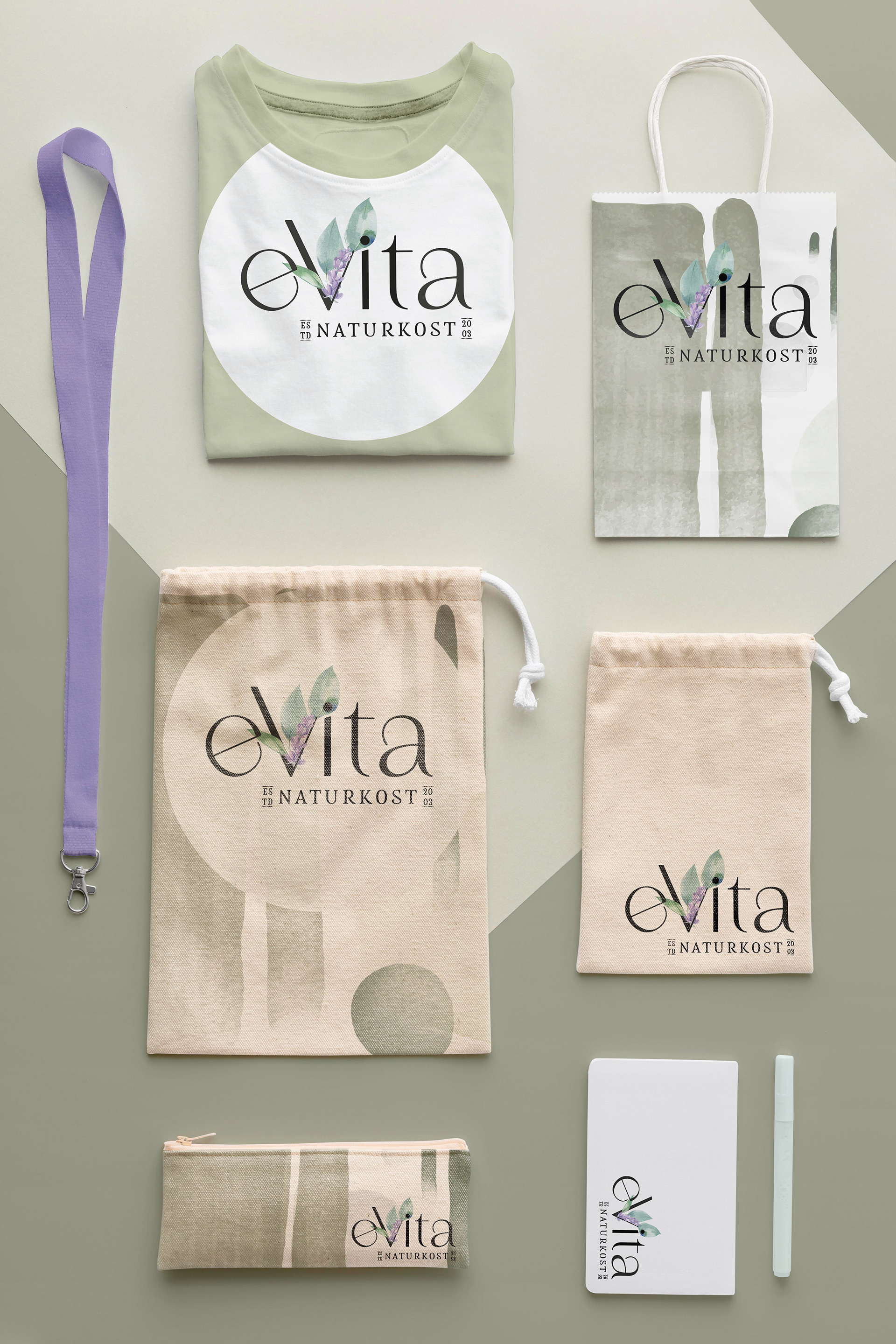
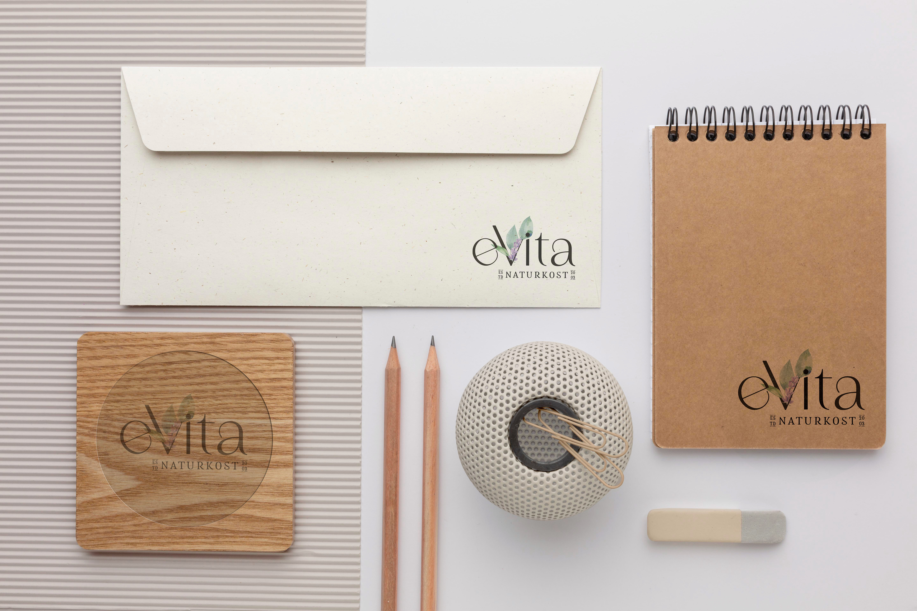
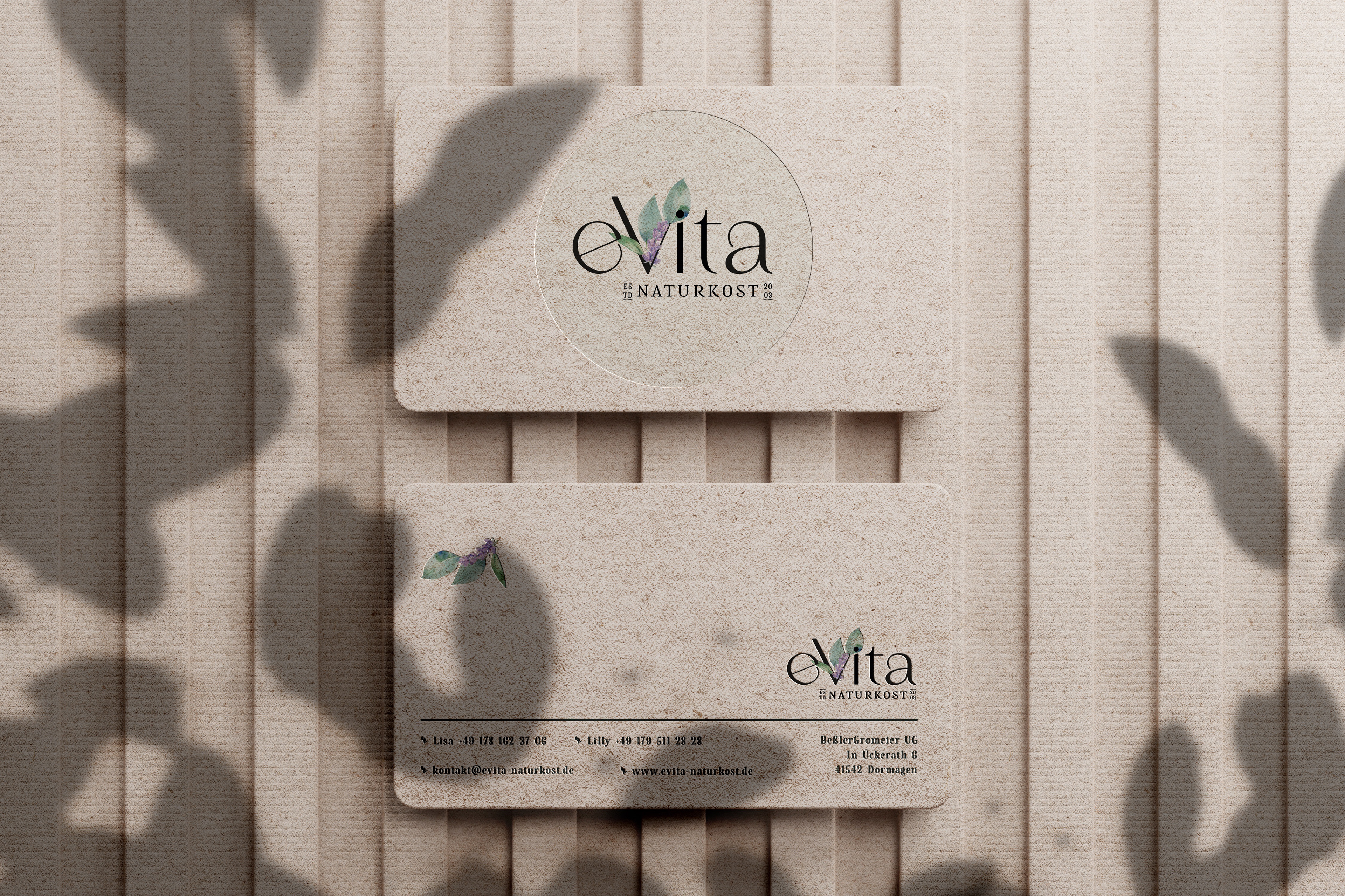
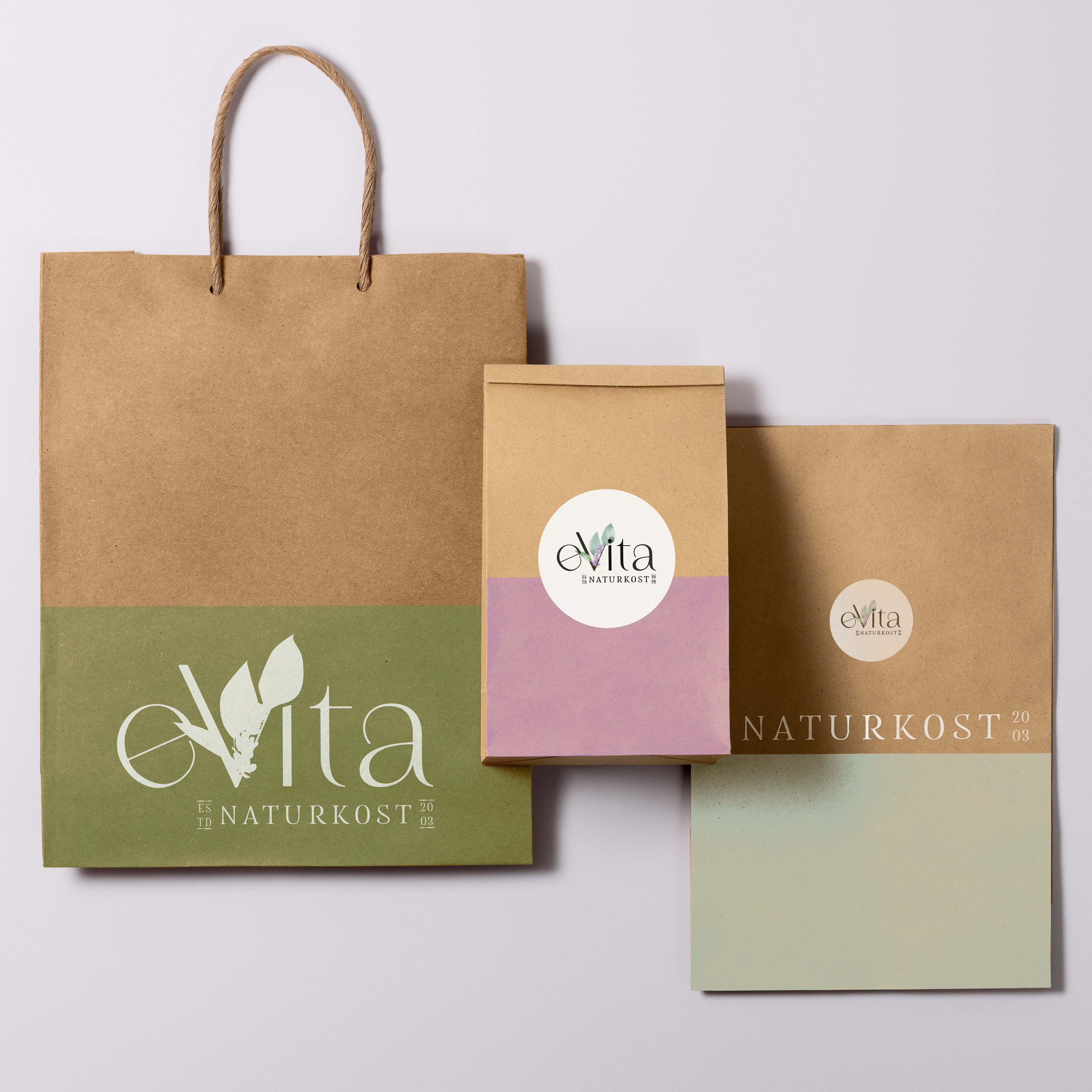
The colors embody a huge spectrum of possibilities.
Backgrounds

Backgrounds
Backgrounds
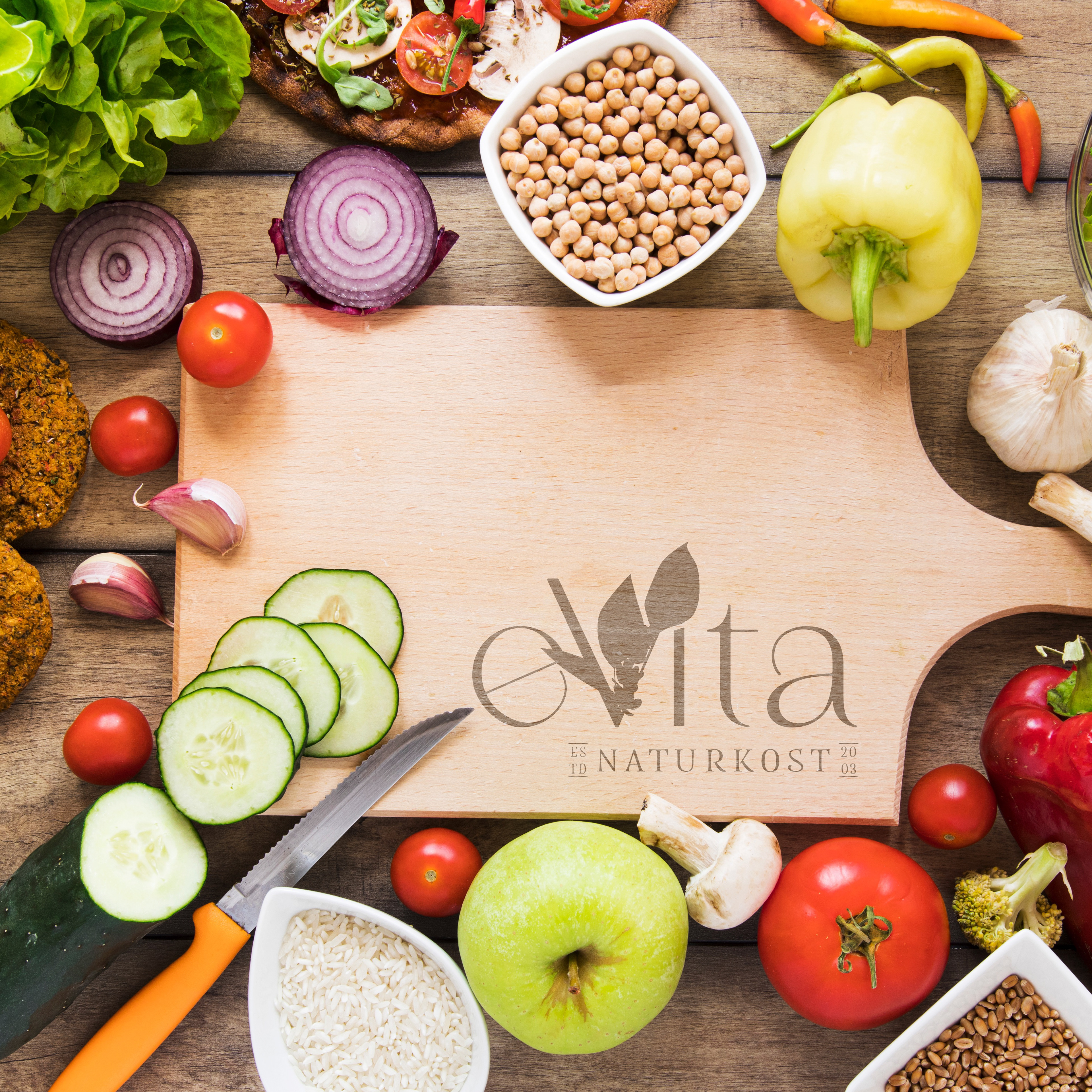
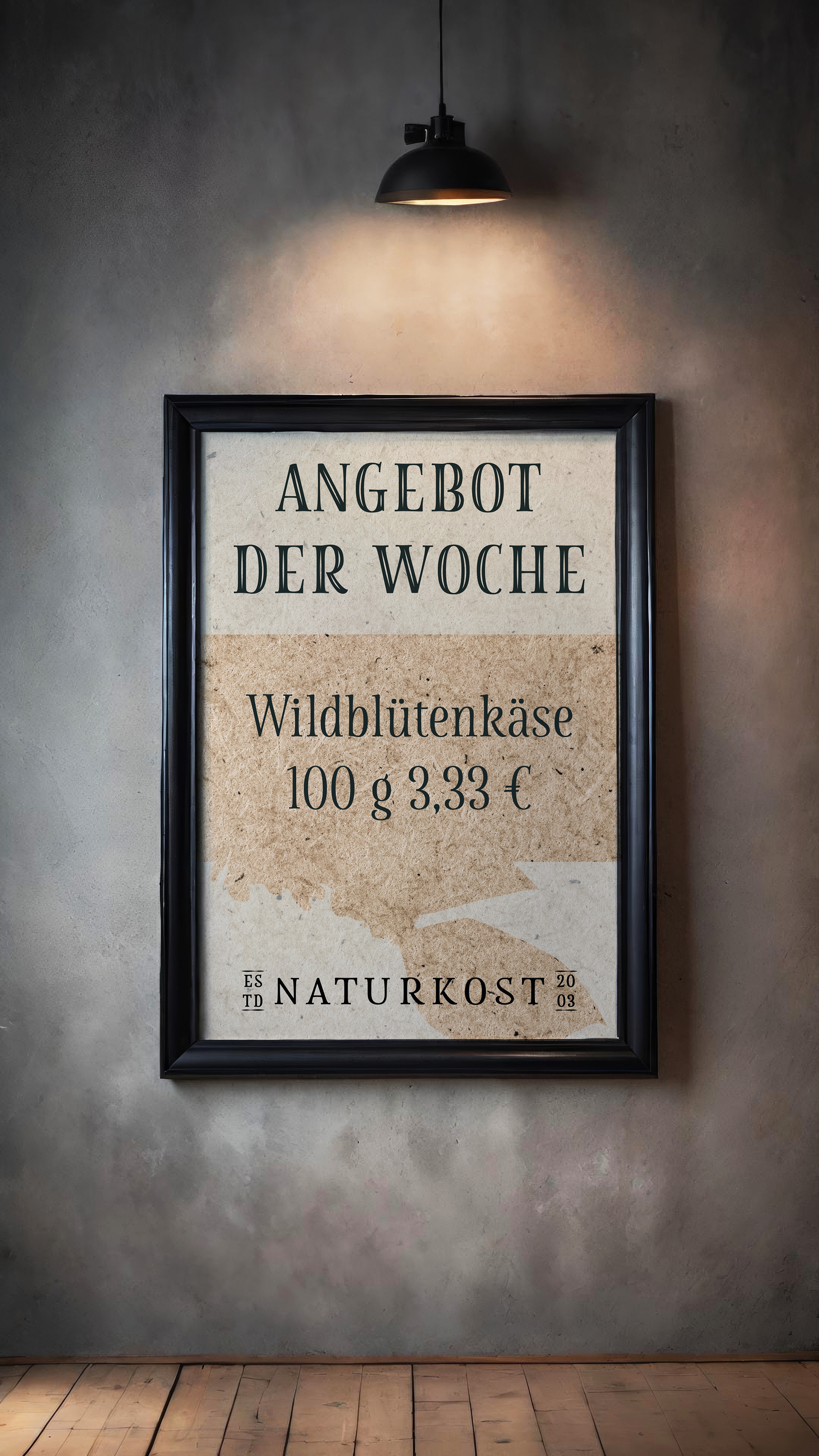
Brand Identity:
The brand identity is designed to be warm, welcoming, and true to eVita’s core values—natural, authentic, and eco-friendly. We chose typography that’s modern but still friendly, with soft curves that feel inviting. From packaging to digital platforms, the brand comes to life with a consistent, energetic look that stands out in the organic food space and speaks to a community of people passionate about healthy living.
The brand identity is designed to be warm, welcoming, and true to eVita’s core values—natural, authentic, and eco-friendly. We chose typography that’s modern but still friendly, with soft curves that feel inviting. From packaging to digital platforms, the brand comes to life with a consistent, energetic look that stands out in the organic food space and speaks to a community of people passionate about healthy living.
Together, we brought eVita Naturkost's vision to life—creating a brand that’s vibrant, down-to-earth, and ready to make a positive impact.
