Photographic Design
Motif
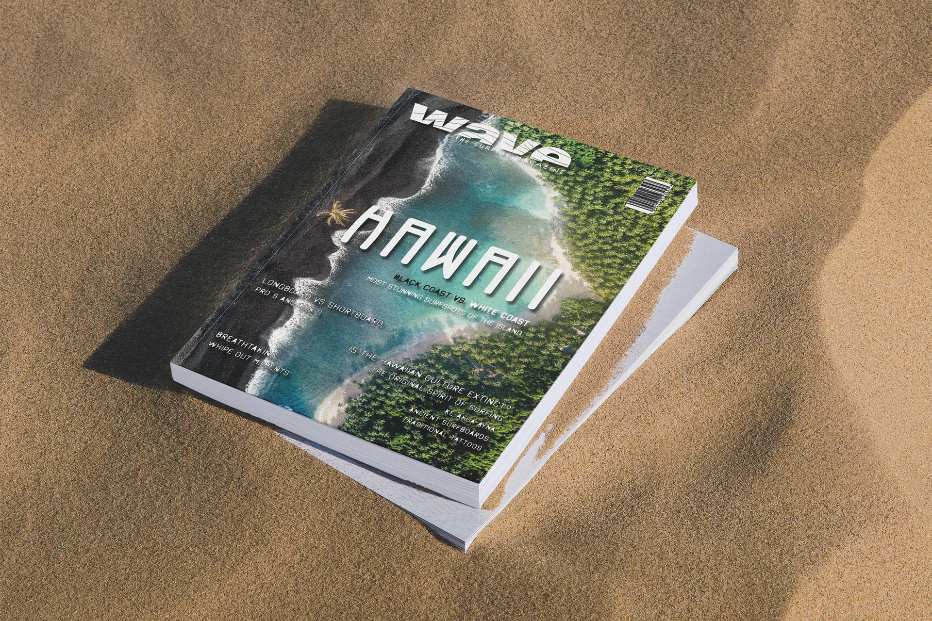
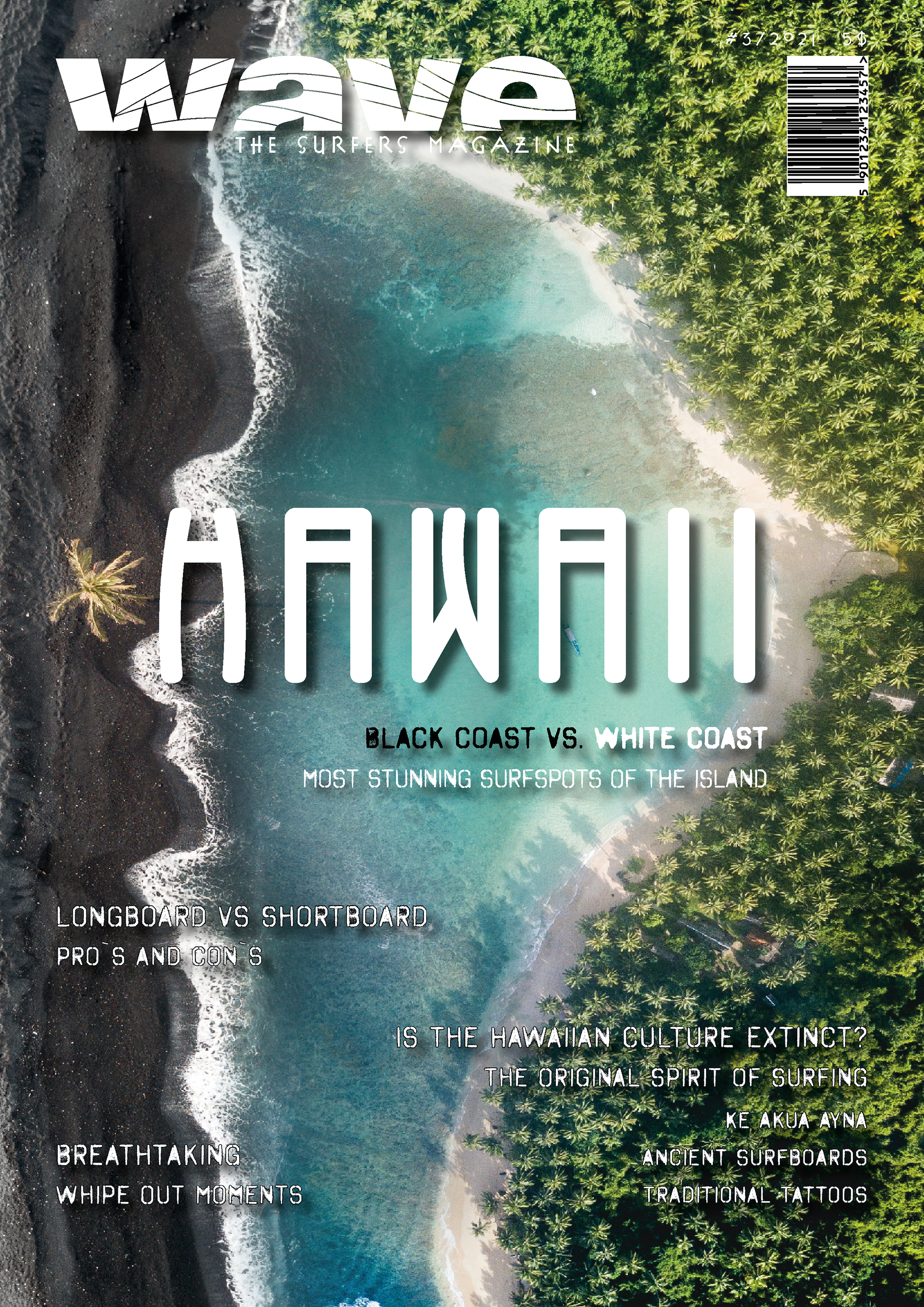
Hawaii is famous for it's black and white sand beaches.
Hawaii is famous for it's black and white sand beaches.
I created a photomontage of two pictures I found on unsplash.com. The black beach and its lonely palm tree is in contrast to the white sand beach, full of juicy green, separated by the turquoise blue water.
The unrealistic image immediately makes you look a little longer.
Format
The two-column grid seemed perfect to me. This way, the text blocks are opposite to each other.
I kept a left-right rhythm in the layout to imitate waves coming and going. That reinforces the name of the magazine.
The two-column grid seemed perfect to me. This way, the text blocks are opposite to each other.
I kept a left-right rhythm in the layout to imitate waves coming and going. That reinforces the name of the magazine.
Typography
Surfer magazine is meant to appeal to surfers of all ages. A dynamic layout and a fancy non conservative font, seemed appropriate here.
Surfer magazine is meant to appeal to surfers of all ages. A dynamic layout and a fancy non conservative font, seemed appropriate here.
The Cover theme is in the "P22 Arts and Crafts/ Tall" font. The W reminded me of surfboard tips. It is placed in the center of the cover right next to the palm tree of the black beach.
The Headline font is "Octin Spraypaint." I have seen these spray-painted stencils many times on various signs on beaches and also on surfboards.
The Title "Black Coast vs.(in black) and "White Coast" (in white) to further enhance the design of the cover page.
The law of proximity makes it clear which information belongs together. A drop shadow and outlines, make the white font easier to read.
The law of proximity makes it clear which information belongs together. A drop shadow and outlines, make the white font easier to read.
Illustrative Design
Motif
The most beautiful thing I've ever learned about surfing is that after riding the wave on the top of the board, you turn and bow to express your gratitude to the ocean.
The motif is a left-cropped vector montage of several works by artist Yumi, who I asked permission to use for my assignment.
Typography
The "W" in font "P22 Arts and Crafts - Regular" of the title Hawaii reminds us again of the surfboard tips. The blue tones are from the water in the illustration. It is centric at the bottom of the page, "inside the water."
The rest of the title lines are in "Hothouse" font with text and outline colors from the illustration in a reverse color scheme of the title theme. The dynamic, playful typeface reflects the character of the Hawaiian surf culture.
Typographic Design
Motif/ Typography
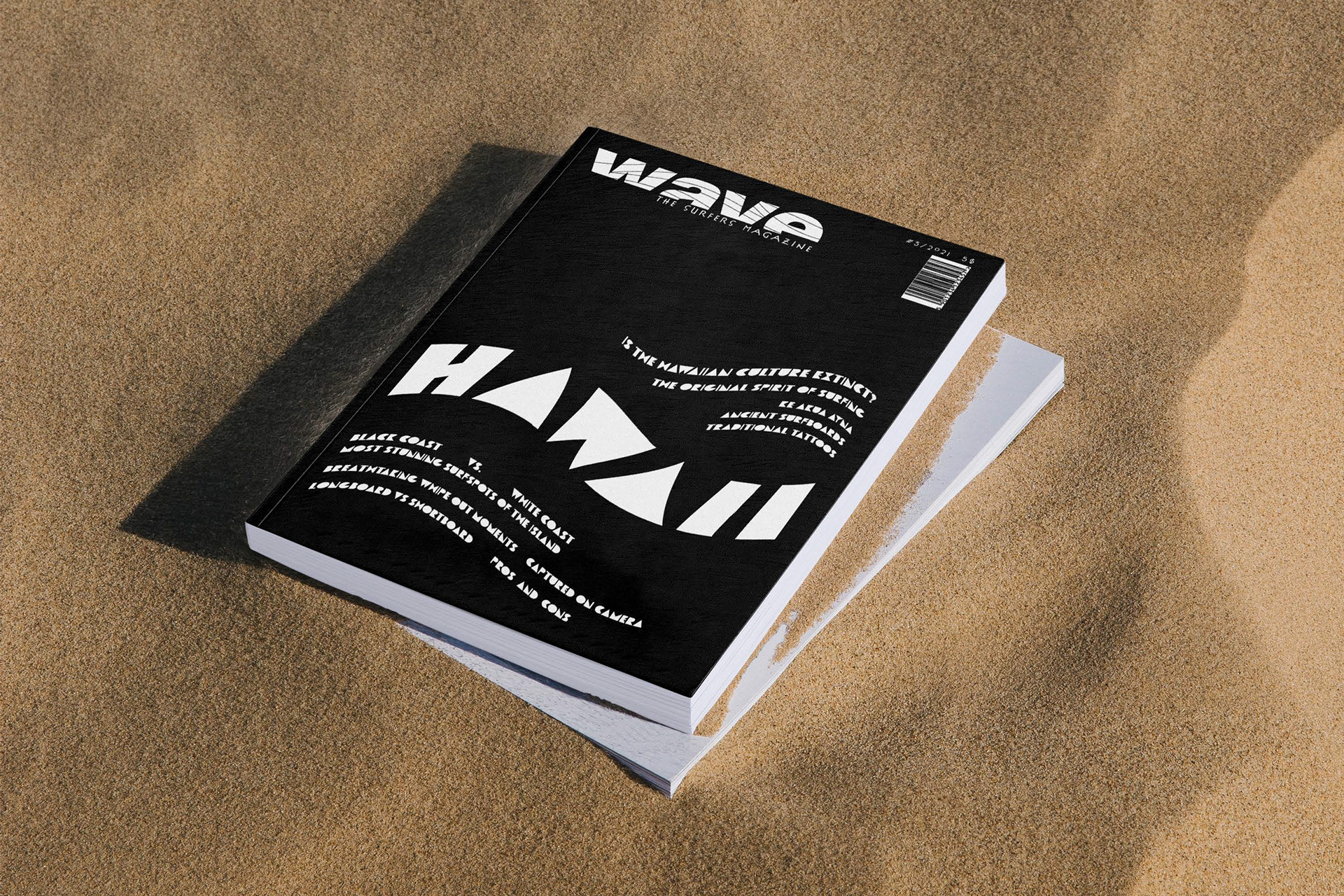
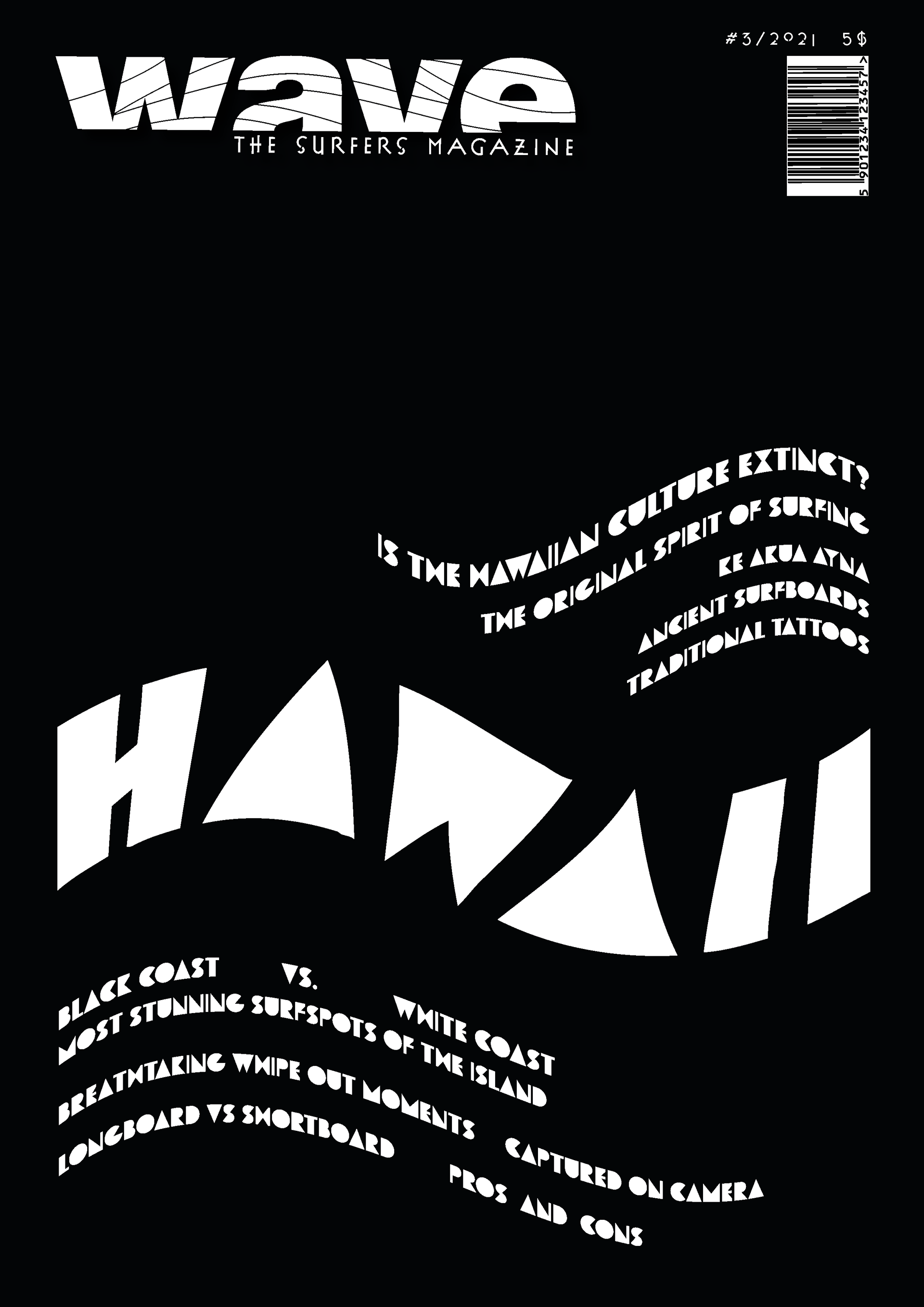
Something that's as well known as Hawaii's beautiful waves and the ancient surf culture are the traditional tattoos on surfers' bodies.
The typeface with its partially wedge-shaped letters reminds me a lot of these tattoos.
In Illustrator, I've used an warp effect to create a wavy design. It is placed in the lower third to convey a horizon over the water.
Black as the background is an allusion to the black sand beaches.
"I wanted to highlight the ancient Hawaiian culture and bring awareness to an island and sport dominated and colonized mainly by white men.
The representation of women in the design was also important to me since they are generally under-represented in surfing."
The representation of women in the design was also important to me since they are generally under-represented in surfing."
