
The Ms. Undastood Logo · Concept
Miss, that's me.
The name evolved from the word and the feeling of being misunderstood.
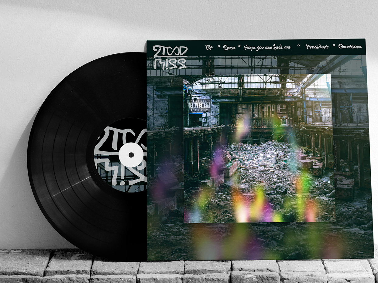
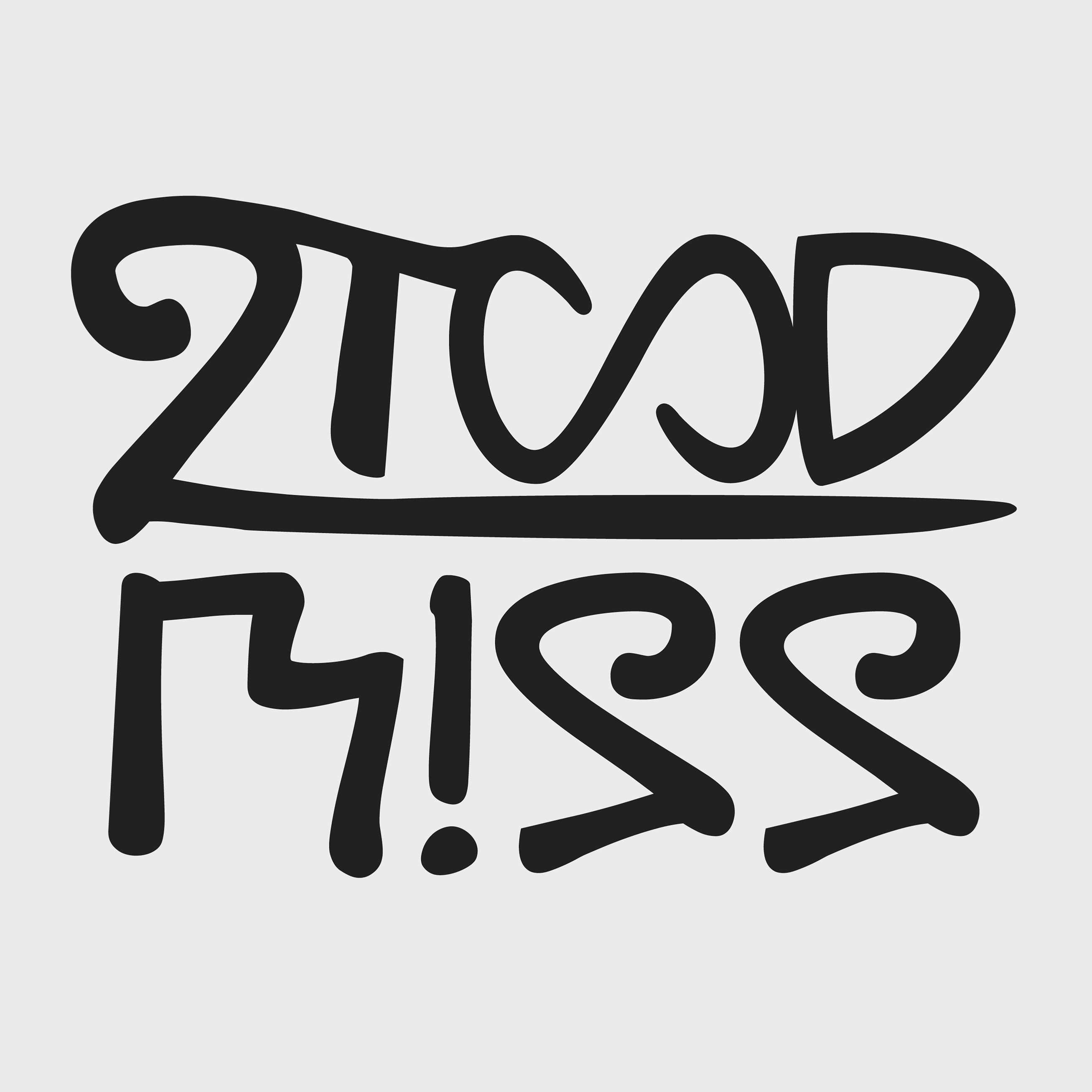
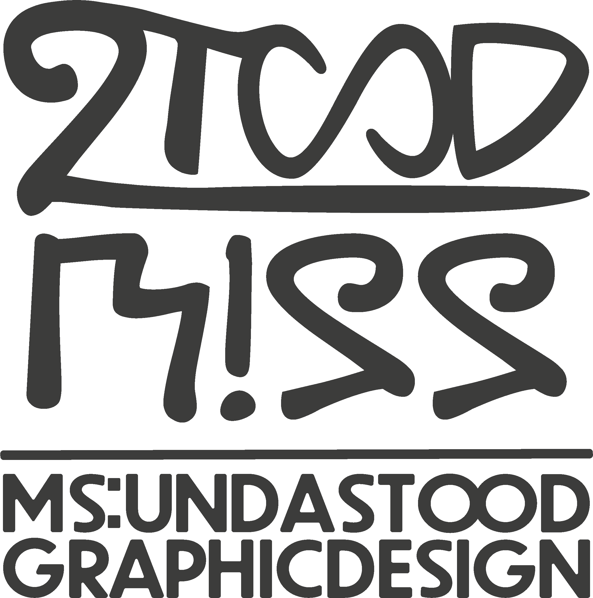
In the logo, MISS sits under STOOD, like in a division.
I understood that it's not about how the world perceives me, but about how I carry myself.
So I transformed from Misunderstood to Ms. Undastood.
The M is formed like steps, the steps I took to get where I am now.
The three S's became 2's: 222, a message from the Universe. I started seeing the number everywhere once I changed my mindset. It tells me when I am in the right place at the right time.
The O's turn into an infinity sign, for an abundance of creativity, growth and passion.
I also wanted the logo to look like a tag, to express my love for Hip Hop and the 90s.
Ms. Undastood. The journey from misunderstanding to understood!

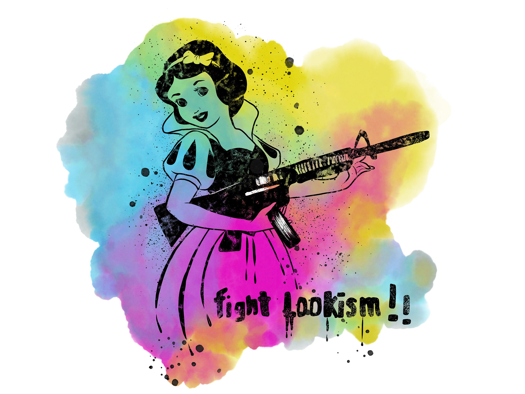
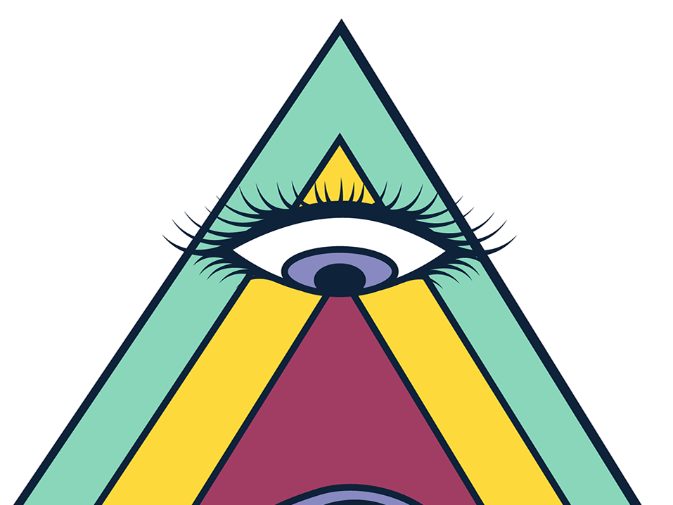
The colors are CMY2K style, a mix of CMYK and Y2K, because I'm a millennial. I grew up in a more or less analog world, with a lot of privacy and boredom. That gave me space for creativity, and I learned all the technology along the way.